Colors are becoming grayscale in design
Grayscale colors are being embraced in modern design. This change is evident across most industries.
September 28, 2022
Modern design can be defined as design with clean lines and geometric shapes, a monochromatic color palette and the use of minimalism. Minimalism can be described as “less is more.” The style strives for simplicity and neatness, and usually uses neutral tones, which is what sometimes draws people to it. This differs from maximalism, a style of flamboyant colors, shapes, and textures that are eye-catching. Modern design has grown in popularity and since it uses a monochromatic color palette, it could explain the rise in designers using an excessive amount of grayscale and neutrals than other colors.
“Seeing grayscale colors being used more frequently in modern design is interesting to see. As much as I love color, seeing something that is more muted gives more of a variety to art and can help direct the attention to other things,” Marjory Stoneman Douglas High School freshman Aditi Sawant said.
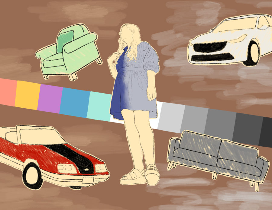
In order to understand this shift in design trends, it is important to know what the grayscale is. The Grayscale is a spectrum of whites, grays, and blacks. Think of it like the colors you would see in a black and white movie. These are the colors that are being used more frequently in design.
A great example of showing the change in popular colors is cars. Since 1953, Axalta, a company that specializes in paints and coatings for automotives, releases an yearly global survey that details the popularity of car colors. The company’s most recent survey in 2021 showed that the most popular color globally was white (35%) followed by Black (19%), Gray (19%), Silver (9%), and Blue (8%). Only one color in the top five is not on the grayscale, and it is blue, at the bottom.
In North America, the top five for car colors are White (28%), Gray (21%), Black (20%), Blue (10%) and Silver (10%). This contrasts with the first survey in 1953, in which the top five colors in North America were Green/Teal/Aqua, Blue, Gray, Brown, and Black. There was even Coral in the top five for 1957 and 1958. It seems that colors on cars showed the popular colors in design at the time. Since 2006, white has held first place among popular car colors. The car colors reflecting the trends can also be seen in the media.
When you look at older movies and tv shows compared to recent ones, you can see a difference in the car colors as well. In the movie Matilda, which came out in 1996, there is a scene in Wormwood Motors, a used car dealership, that exemplifies the change in color pallets. In the parking lot of the scene, you can see cars that are red, blue, yellow, and green.
In The Goonies (1985), even though the bad guys drive a black car, you can see a scene where someone is driving a red Ford Mustang GT. However, a lot of modern movies have cars that are colored more neutrally, like in marvel movies, where you can see cars in the background that are black, gray and white. Car colors throughout history have reflected the color trends of the times, and now it seems designers are choosing to use grays and neutrals over others.
“I do feel like designers are working with more of a grayscale right now. It is versatile and often timeless. The contrast between black and white is pretty popular,” Cyndi Dorvil, the co-owner of Custom Homes Building and Remodeling and the admin and manager of client selections said.
These trends in grayscale can also be seen with popular paints colors from home design brands. The top paint color samples on Lowe’s online website right now are mostly neutral. Agreeable Gray, Gravity, Repose Gray and Sea Salt are the first four at the top and are all gray colors. The only colors that are not on the grayscale in the top colors are Long Horizon, a dark blue, Icelandic Blue and Diamond Weave, a beige.
Benjamin Moore’s website also displays their most popular interior paint colors right now. White Dove, Chantilly Lace, Cloud White, White Heron, Swiss Coffee, Classic Gray, Calm, Pale Oak, Gray Owl, Edgecomb Gray, Revere Pewter, Stonington Gray, Balboa Mist, Coventry Gray and Manchester Tan. There are very little colors outside of the grayscale that are popular right now, and most of the time those are neutrals.
The colors can also be observed with furniture and decor. Brands like Ethan Allen right now have pictures on their online website that include a lot of white, gray and black. Their top picks in the Bedroom Section include bed frames that come in blacks, grays, and browns. Most of the duvet covers and comforters have a choice to be or are white in their designs. They have pictures of room designs you can click on to shop the items in the picture and most include colors on the grayscale.
“You can then add color, texture, and visual interest with your furniture, accessories, and wall decor. It is much easier, and cheaper, to switch out those items when you want to change your style than going through another renovation. Therefore, I think the trend will be around for a while,” Dorvil said.
Trends come and go, but colors on the grayscale and neutrals may never go away. The colors are easy to include in a color palette because they are flexible with many other colors and have usually been used as an accent color with a lot of palettes.
